
How to write a style bible Claude will follow: look spec, motion spec and banned list
November 5, 2026 · 9 min read
Ask Claude for a video with no further direction and you will get a recognisable film: large text in the centre, a gradient behind it, everything fading in, a logo at the end. Several creators who studied the viral clips of late 2026 described exactly this default, and one gave it a name: brief contagion. Hundreds of people sent the same short prompt and got videos that rhyme with each other.
The cure is not a longer adjective list. It is a style bible: a short, precise document that tells Claude what every frame looks like, how things move, what is forbidden, and which references prove it. This tutorial shows how to write one, using the best published examples as models, and how to make Claude actually follow it from the first shot to the last.
Why the default look happens
A model filling a blank chooses the safest option it knows. With nothing about palette, it picks a gradient. With nothing about entrances, it fades. With nothing about layout, it centres. As seeco (@seeconvm) puts it, a vague prompt leaves every decision open and each one gets the safest default. Ernesto Lopez makes the same point more bluntly: Claude's designs are purple gradient by default, and its edits will look default too unless you direct them.
So the job of a style bible is to remove the open decisions before rendering starts. Every line should replace a default with a choice.
The single best idea: split the look from the motion
Sergio Gil's Vox-style template for the Calliope service keeps two prompts in two separate fields. One describes what every frame looks like, with no motion in it: surfaces, palette, typography, composition, prohibitions. The other describes how things move, with no colours in it: camera, entrances, rhythm, transitions. He calls mixing them the most common reason a collage video comes out flat, and gives a concrete example of the damage: motion words like "slow push in" in the image prompt bake fake blur into stills instead of moving the camera.
The principle applies just as well when Claude draws everything in code. A look spec answers "what is on screen at any frozen moment?". A motion spec answers "how does it get there and leave?". Keeping them apart makes each one testable: the look spec on a single still, the motion spec on a short strip of frames.
Part 1: the look spec
Write every visual decision as a value Claude can apply without interpretation. Hex colours, not "premium". Named fonts with weights. Sizes as ratios. The proportion of the frame the hero element takes. The published specs that people copied most, from Finn's Kurzgesagt-style prompt to Elvar's children's book cutaways, all read like this.
Look spec template
CANVAS     background (hex or gradient with both hex values),
           texture (grain %, paper, none), vignette
PALETTE    3-5 swatches with names and hex; ONE accent and exactly
           what it may be used for (e.g. underlines, counters only)
TYPE       display face + weight, UI/caption face + weight,
           size scale (S/M/L/XL as ratios), tracking, case
LINE       outline weight and colour, or "no outlines"
SHADING    flat / 3 tones per colour / soft gradient; shadow colour,
           length and hardness (e.g. short, warm grey, never purple)
COMPOSE    one hero element at ~70% of visual weight, 2-3 supporting
           elements max, negative space, safe area for captions
TEXT       when on-screen text is allowed and how long (1-4 words)
CHARACTER  proportions, palette, the one identifying mark
Two details from the best specs are worth copying. Reserve the accent: Sergio Gil's spec allows its hot red only on strokes, underlines, arrows and stat counters, which is why it reads as a signal. And give the frame one hero: about 70 percent of the visual weight on one element, with two or three supporting pieces, instead of five things competing.
Part 2: the motion spec
Motion is where a style becomes a style. Two videos with identical palettes feel completely different if one cuts hard on beats and the other glides. Write rules per kind of object, because nothing should move the same way as everything else.
Motion spec template
CAMERA      how it moves (slow drift, push-ins, one move at a time,
            log-space zoom), what it never does (shake, spin, chase)
ENTRANCES   per object class:
              micro UI   snap, minimal overshoot
              panels     controlled settle
              headlines  hard landing, stable hold
              numbers    count up
              mascot     playful, visible squash and stretch
TEXT        how words arrive (rise through a mask, type on, slam);
            never fade in whole
RHYTHM      a new idea every N seconds; cuts on narration beats or
            the music grid; how long holds are
TRANSITIONS hard cut / shape morph / paper wipe; what is banned
PHYSICS     what feels heavy, what is light; overshoot limits
Write the motion spec in physical terms where the style allows. Sergio Gil's collage motion is all physical: cutouts spring with slight overshoot and settle, pins drop and wobble once, labels type on like a strip being pulled, and text never fades in transparently because, as he notes, paper does not fade in. A rule with a physical reason is one Claude can extend to cases you did not list.
Part 3: the banned list
The banned list is the most underrated part of a style bible, because it targets the defaults directly. Name them. The ones that appear across many published specs:
- Centered title on a gradient.
- Everything fading in, crossfades, blur-ins.
- Text or labels in the corners and frame borders, which Movez relays as a common giveaway of AI-made video.
- Glows on UI, generic particle bursts, lens flares.
- Blue-purple backgrounds dominating the film; one skill's delivery check rejects films where that palette covers more than 30 percent.
- Long holds where nothing moves, and dead blank frames.
- AI-looking smoothness: perfect curves where the style wants hand texture.
- Invented product screens or numbers.
Then add the style-specific bans that only someone who has seen the failure would write. Finn's space prompt bans prominences on the Sun's edge because they read as white hooks. zero (@twoclipping) bans dark 3D looks for launch films, because he found they never read as high end. Every one of these is a fix written in advance.
Part 4: references set the ceiling
Words like "archival tan" or "torn paper edge" mean twenty different things until an image pins them down. Sergio Gil's line is the best summary in this whole genre: a prompt sets intent, a reference sets the ceiling. His template attaches six images: one master sheet and five shot examples covering the situations the style keeps running into.
If you are working from a reference video, have Claude analyse it into the bible rather than imitate it directly. Extract frames, then write the palette in hex, the type, the shot lengths, the transitions, the camera and the grain into a style guide file, and take the grammar, never the subjects, logos or copy. Several creators also found that naming a known style works better than describing one, and that your own past work is a reference nobody else can copy.
Reference to bible
Reference: refs/*.png and refs/clip.mp4
1. Extract a frame every 0.5 s from the clip and study all images.
2. Write docs/style.md with LOOK and MOTION as separate sections,
   values not adjectives (hex, font names, seconds, ratios).
3. Add BANNED: the defaults this style must avoid.
4. Mark each value MEASURED (from a frame) or DECISION (mine).
5. Never copy subjects, characters, logos or copy.
6. Show me the file and two test stills before any motion.
Part 5: put it where Claude reads it every time
A style bible in a chat message is forgotten by the next session. Put it in a file in the project: a CLAUDE.md that Claude Code reads on every run, or a style.md that the CLAUDE.md tells it to read before any work. Several creators keep a whole studio folder: a brief, a style guide, a shot list, approved assets, source, reviews and outputs. In rari's words, if the only record of a film is a conversation, you had a lucky session, not a production system.
Keep the bible short enough to be read in full every time. A page is plenty. When you find a new failure, add one line to the banned list rather than writing a paragraph.
Part 6: test the bible on stills
Before any motion, ask for two or three stills of very different moments: a busy one, an empty one, one with text. The look spec is either followed or it is not, and stills show it in seconds. Common findings: the accent colour has leaked onto a background, the hero is fighting three other elements, a shadow is long and purple, the font fell back to a system face because it was not loaded.
Then ask for a short strip of consecutive frames around one entrance of each kind. That tests the motion spec without a full render. Our post on the critic loop covers the review side in full.
Kinetic type · 29 s
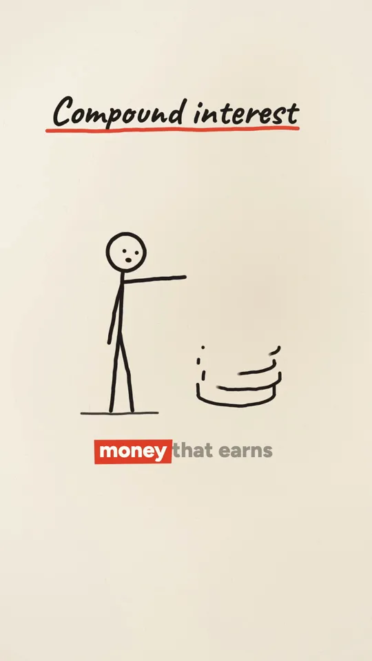
Ink stickman · 32 s

Diagram explainer · 41 s
Part 7: keep the series consistent
For a series, add a character section that survives every episode: proportions, palette, expressions and one identifying mark. Archive's AI coach workflow and Sergio Gil's template both treat locking the character as a step before anything else, and approving the character sheet as the last cheap moment to fix a face or a silhouette. In code-drawn video the character is a function, so consistency is free once the function is right, but the bible is what stops a later prompt from "improving" it.
And rotate what should rotate. A bible that fixes palette, type and motion can still let settings, topics and supporting colours vary, which is what keeps a series from reading as a template.
Directing Claude so it does not drift
- Give notes in camera and timing words, not taste words. "Slow every zoom to 0.7x", "hard cut here" and "make the zoom hit on the drop" get the change you want; "make it better" gets a random one.
- One change per note, with what must stay fixed.
- Ask for three storyboard or style variants at the start and pick one, instead of fixing the first idea. Rexan Wong's workflow, relayed by Movez, recommends exactly this.
- When the output drifts, quote the line of the bible it broke. The fix becomes obvious to both of you.
- Keep one project per brand or series so the renderer, audio and bible carry over between videos.
Pitfalls
- Adjectives instead of values.
- Motion words in the look spec, colours in the motion spec.
- No banned list, so every default creeps back.
- An accent colour with no usage rule.
- References that contradict the written spec. Pick references that agree with it.
- A bible so long that only part of it is read.
- Copying another creator's characters or a studio's identity. A bible is for your own look.
Cost and time
Writing a good bible takes an hour or two the first time, and it is the cheapest hour in the whole process because it saves re-renders. Testing it on stills costs a few minutes of Claude usage. After that, every video in the series starts from the same decisions, which is the main reason the second and tenth videos in published accounts came out faster and better than the first.
Doing it in about 3 minutes with WhatToUpload Video Studio
Video Studio's styles are style bibles already written, tested and fixed: you pick one, type one sentence, and Claude writes the script and storyboard while our renderer draws every frame as code in that style, ElevenLabs voices it and captions and sound are timed. A video takes about three minutes. The styles live today are Kinetic type, Ink stickman and Diagram explainer, with more being added.
A 30 second video is 26 to 30 credits, and plans are $19, $49 and $99 a month.
Sources and methodology
Built from creators' published articles and posts on X, read in full in November 2026. The templates here are our own wording, modelled on the structure those creators shared.
- 01Sergio Gil: How to make a Vox Style video: Full Prompts & TemplateX Article, Aug 30, 2026. The visual_style and video_style split.
- 02seeco (@seeconvm): What the viral one-prompt videos are hidingX Article, Oct 3, 2026. Brief contagion and the render contract.
- 03rari (@0xwhrrari): Motion Engineering, build a video studio around Opus 5.5X Article, Oct 1, 2026.
- 04Finn (@finnardley): Kurzgesagt-style promptOct 25, 2026. A look spec written in values.
- 05Elvar: machines you can run, with a children's book lookX Article, Oct 18, 2026.
- 06zero (@twoclipping): launch films and the 2D lookX Article, Sep 28, 2026.
- 07Movez: motion design studio full courseX Article, Sep 27, 2026.
- 08Ernesto Lopez: the new moat is being a good directorOct 26, 2026.
Frequently asked questions
Why do all my Claude videos look the same?
Because every decision you did not make is filled with a safe default: a gradient, a centred title, fades. A style bible replaces those defaults with specific values, references and a banned list.
What is the difference between a look spec and a motion spec?
A look spec describes any frozen frame (palette, type, composition, texture) with no motion words. A motion spec describes how things enter, move and leave (camera, entrances, rhythm, transitions) with no colours. Keeping them separate makes each testable.
Where should I keep the style bible?
In a file in the project, such as CLAUDE.md or a style.md it references, so Claude Code reads it on every run and every video in the series starts from the same rules.
Do I need reference images?
They help a lot. Written specs set intent; references show the exact texture, weight and spacing. Use references that agree with your spec, and never copy their subjects.