
How to make a Vox-style paper collage documentary with Claude
November 5, 2026 · 10 min read
You know the look even if you have never named it. Black and white photographs cut out with rough scissors, a white keyline around them, an offset red stroke behind. Torn newsprint, masking tape, a typewriter label reading "Fig. 3". A map with brass pins joined by red string. One number, huge, in hot red. It is the visual language of a certain kind of explainer documentary, and it is one of the most requested styles among people making video with Claude.
There are two ways to make it. A generation route, where Claude directs an image and video service with a carefully written template. And a code route, where Claude draws every cutout, texture and pin itself. This tutorial covers both, built from the creators who published their methods, and is honest about where each one is strong.
A note on names: Vox is a real publisher with its own designers. The collage grammar is widely shared; their branding, footage and episodes are not yours to copy. Make your own topics, cutouts and stories.
What defines the look
- A persistent stage: one aged paper or muted archival map surface that every shot lives on, so elements feel like they enter and leave the same tabletop.
- Halftone photo cutouts with rough edges, a white keyline and an offset accent stroke.
- Physical materials: torn paper, tape, typewriter strips, rubber stamps, pins and string.
- A desaturated palette (tan, ink black, halftone grey) with one hot red reserved for emphasis, and at most one secondary accent.
- Condensed bold caps for headlines, numbers treated as hero characters, small typewriter annotations.
- One hero element per frame and a lot of negative space.
- Layered depth: foreground cutouts shifting slightly against a locked background.
- Physical motion: things spring, drop, slide, peel and tick. Nothing fades in like a ghost.
What creators published and claimed
Sergio Gil (@seergioo_gil) published the most complete template, "How to make a Vox Style video: Full Prompts & Template", for Calliope, an AI image and video service he works on, driven from Claude through its MCP. It has a master agent prompt, an image prompt, a video prompt and six reference images, with exact palette values. In a follow-up he gives the service's prices as $12.96 per minute on its highest model and $3.30 on a newer medium one. These are a vendor's own prices, and this route generates imagery rather than drawing it in code.
Naomi Metzger spent four days teaching Claude to edit in this style and published a ten minute video; its chapters point at what mattered to her: what makes the look, layers and parallax, Claude reading After Effects project files, training Claude with tutorials, free assets in tutorial descriptions, starting with the voice, and storyboards. Romain Torres built a Vox-style ads skill on another generation service, shared only to people who commented. And the huashu-art-motion skill includes a Vox explainer style in code: clippings, red lines, highlighter.
On the code side, Raphael Aubry made a paper-zine music video where every lyric is a cut-paper ransom note stamped on the beat, with no video model at all, which shows that the paper look is well within reach of pure code.
Step 1: start with the voice and a dated hook
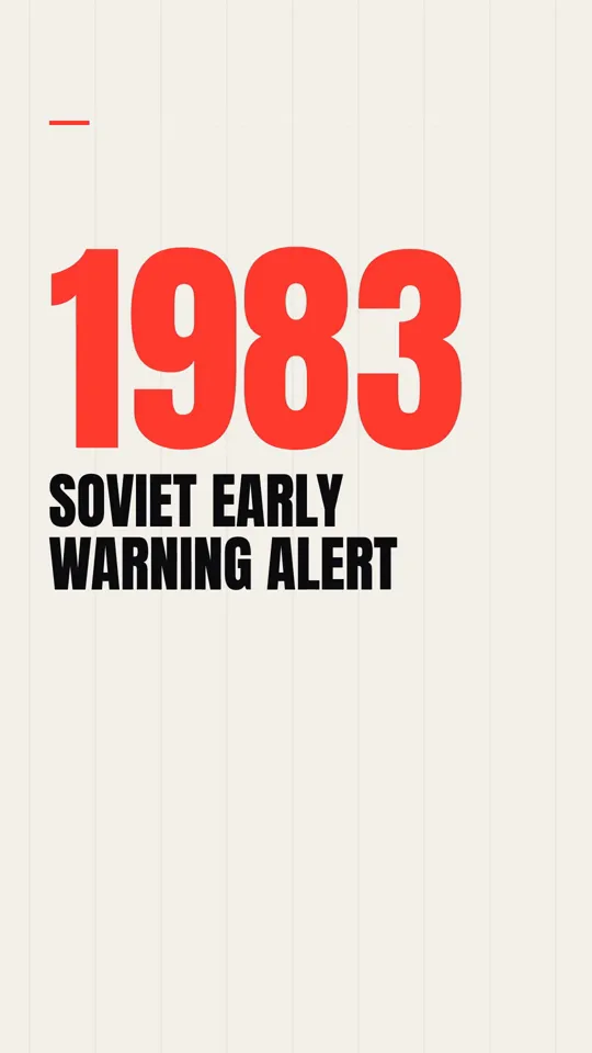
This style is narration-led. Write and record (or generate) the voice first and build the visuals to it, which is the order Naomi Metzger recommends. The hooks that suit the look open with a number or a date: "In 1983, a computer told a Soviet officer five missiles were coming." One idea per beat, one red element per scene, and a narrator only, no dialogue on screen.
Write the storyboard with timestamps from the voice: which hero element is on the stage for each line, which supporting pieces, and which single label (if any) appears. Sergio Gil's rule for on-screen text is a good limit: if a beat carries a date, a name or a number, it may appear as one short label of one to four words on a paper strip or a stamp. Otherwise, no text.
Step 2: write the look and the motion separately
The most transferable idea in Sergio Gil's template is that the look and the motion live in two separate prompts. The look describes surfaces, palette, type and prohibitions with no motion words; the motion describes camera, entrances, rhythm and transitions with no colours. He calls mixing them the most common reason these videos come out flat. Our post on writing a style bible explains the principle in depth; here is a compact version for this style, in our own values.
Look spec (our values)
STAGE    aged newsprint / muted archival map, even light, grain
PALETTE  tan #CBBE9F, ink #1B1B1B, halftone grey #8E8E8E,
         hot red #D33224 (strokes, underlines, arrows, counters only),
         mustard #D8A646 (secondary, sparingly)
CUTOUTS  B/W halftone photos, rough scissor edge, 6 px white keyline,
         offset red stroke behind, soft short drop shadow
PAPER    torn edges, tape fragments, typewriter strips, stamps,
         brass pins and red string only when connecting things
TYPE     condensed bold caps for headlines; numbers as heroes;
         typewriter for "Fig." labels
COMPOSE  one hero ~70% of weight, 2-3 supporting pieces, space
FIGURES  public figures may get a flat black eye bar
BANNED   glossy 3D, lens flares, gradients on cutouts, neon,
         baked motion blur, AI smoothness, paragraphs of text
Step 3: the motion rules
Every rule in this style is a physical rule, because everything on screen is meant to be paper being moved by an invisible editor. The camera treats the stage as a tabletop: a slow drift of a couple of percent, gentle pushes, never fast zooms, shakes or spins. Cutouts spring up with a slight overshoot and settle. Counters tick upward. A red underline swipes left to right under a headline word. Pins drop and wobble once. Cards slide in with a little shuffle; torn cards peel into frame. Cuts land every one to three seconds on narration beats, hard cuts or the occasional paper wipe, never dissolves.
And text never fades in transparently. It arrives as an object: a strip sliding into place, a stamp landing, a typewriter line being pulled.
Step 4a: the generation route
If you use an image and video service through Claude, the published template's workflow is the one to follow. Attach the reference images and both style prompts in one message and have Claude create a project template from them verbatim, with the look prompt in the visual style field and the motion prompt in the video style field. Have it write the timestamped storyboard, quote the exact cost and wait for your yes, then generate with manual approval. Approve the character reference sheet before anything else is generated; Sergio Gil calls it the last cheap moment to fix a face or treatment.
His common mistakes list is worth keeping: motion words in the image prompt, red spreading onto backgrounds, five or six cutouts in a frame, attaching the prompts without the references, and asking for paragraphs of on-screen text. In his one-shot test the model also scattered red strings everywhere, fixed with one sentence in the motion prompt.
Step 4b: the code route
In code, Claude draws the whole thing in a canvas inside a seek(t) function. The ingredients are surprisingly simple. Halftone is a grid of dots whose radius follows the image's brightness. A torn edge is a jagged polygon with seeded noise. Paper texture is a noise field multiplied over the background. The offset red stroke is the cutout's silhouette drawn again in red, shifted a few pixels, underneath.
Sketch: a halftone cutout with a torn edge, seeded so every frame matches
function halftone(ctx, img, x, y, w, h, cell = 7) {
  const d = sample(img, w, h);              // brightness 0..1 per pixel
  ctx.fillStyle = "#1B1B1B";
  for (let j = 0; j < h; j += cell) for (let i = 0; i < w; i += cell) {
    const r = (1 - d(i, j)) * cell * 0.62;  // darker = bigger dot
    if (r > 0.4) { ctx.beginPath(); ctx.arc(x + i, y + j, r, 0, 7); ctx.fill(); }
  }
}

function tornRect(ctx, x, y, w, h, seed) {
  const rnd = mulberry32(seed);             // seeded, never Math.random
  ctx.beginPath(); ctx.moveTo(x, y);
  for (let i = 0; i <= w; i += 6) ctx.lineTo(x + i, y + (rnd() - 0.5) * 5);
  for (let j = 0; j <= h; j += 6) ctx.lineTo(x + w + (rnd() - 0.5) * 5, y + j);
  for (let i = w; i >= 0; i -= 6) ctx.lineTo(x + i, y + h + (rnd() - 0.5) * 5);
  for (let j = h; j >= 0; j -= 6) ctx.lineTo(x + (rnd() - 0.5) * 5, y + j);
  ctx.closePath();
}

window.seek = (t) => {
  drawStage(t);                              // locked paper background
  const s = spring(t - 1.2);                 // cutout springs in at 1.2 s
  ctx.save(); ctx.translate(540, 980 + 60 * (1 - s));
  ctx.translate(14, 10); fillSilhouette("#D33224"); ctx.translate(-14, -10);
  tornRect(ctx, -300, -380, 600, 760, 42); ctx.clip();
  halftone(ctx, photo, -300, -380, 600, 760);
  ctx.restore();
};
For the photos themselves, use public-domain or licensed archival images (national archives and library collections are good sources) and let the halftone and cutout treatment make them consistent. If you need a figure you have no image for, a silhouette cutout in the same treatment works and avoids putting words or faces where they do not belong.
Step 5: layers and parallax
The depth in this style comes from layers, not 3D. Keep the stage locked and move foreground cutouts a little against it as the camera drifts: a background map that barely moves, a midground photo that moves a bit more, a foreground label or tape strip that moves most. Small amounts are enough. Naomi Metzger gives layers and parallax their own chapter, and Sergio Gil's motion rules say the same: foreground may shift slightly, the background stage stays locked.
Parallax from one camera value
const cam = { x: drift(t) };                // slow 2% wander
layers.forEach((L) => {
  ctx.save(); ctx.translate(-cam.x * L.depth, 0);  // depth 0.05 .. 0.4
  L.draw(t);
  ctx.restore();
});
Step 6: red string and pins
Connections are the style's signature move, and the easiest to overdo. A pin drops and wobbles once; the string draws itself from one pin to the next as the narrator makes the link. Use them only when the story connects two things, and never as decoration. A sagging string reads as physical: draw it as a curve with a small droop proportional to its length, and draw it progressively by trimming the path with a dash offset.
Step 7: sound
Paper should sound like paper. Small rustles when a card slides, a thud for a stamp, a tick for each counter step, a typewriter clack for labels, under a restrained documentary music bed well below the voice. Place each effect by its measured peak on the frame of the action. Our post on beat sync and sound design has the alignment code.
Kinetic type · 34 s
Kinetic type · 35 s
Pitfalls
- Red everywhere. It is a signal colour; on backgrounds it stops meaning anything.
- Too many cutouts per frame. One hero, two or three supporting pieces.
- Text fading in. Paper does not fade.
- Glossy or smooth images. Keep halftone, grain and rough edges.
- Camera theatrics. The tabletop camera is calm; fast zooms break the newsroom tone.
- Unsourced claims. Documentary looks raise the bar for accuracy; keep a sources file and label estimates.
- Using real people's photos carelessly. Use public-domain images, respect privacy and avoid implying things the record does not support.
- Copying a publisher's branding, graphics or episodes.
Cost and time
In the generation route you pay the service per minute of output; the published prices above are the vendor's own, and they change. In the code route the media cost is close to nothing: public-domain photos, drawn textures and a local or paid voice, plus Claude usage. The code route takes longer to build the first time, because the halftone, torn edges, pins and parallax have to be written once, and then every episode reuses them with new photos and a new script.
Doing it in about 3 minutes with WhatToUpload Video Studio
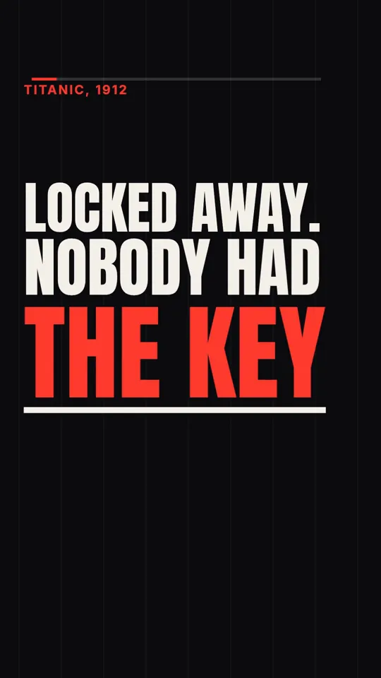
Paper collage is not one of Video Studio's live styles yet. Today you can pick Kinetic type, Ink stickman or Diagram explainer, with more being added. For a documentary-style video right now, Kinetic type is the closest: type the story in one sentence and Claude writes the script and storyboard, our renderer draws every frame as code with one red accent, ElevenLabs voices it, and captions and sound are timed, in about three minutes.
A 30 second video is 26 to 30 credits, and plans are $19, $49 and $99 a month.
Sources and methodology
Built from creators' published articles and posts on X, read in November 2026 (Naomi Metzger's video from its post and chapter list). Prices are vendors' own. The look values and code are our own, written in the same spirit rather than copied.
- 01Sergio Gil: How to make a Vox Style video: Full Prompts & TemplateX Article, Aug 30, 2026. Calliope template; he works on the product.
- 02Sergio Gil: cost per minute follow-upSep 26, 2026. Vendor's own prices.
- 03Naomi Metzger: teaching Claude to edit like VoxVideo post with chapters, Nov 4, 2026.
- 04Romain Torres: Vox-style ads skillJun 30, 2026. Comment-gated.
- 05Raphael Aubry: paper-zine remake and pipelineX Article, Sep 28, 2026.
- 06Vox (@Voxyz_ai): huashu-art-motion explainer stylesOct 12, 2026.
Frequently asked questions
What is a Vox-style video?
A short documentary explainer built from paper collage: halftone black and white cutouts, torn edges, archival maps, typewriter labels and one hot red accent, with a calm tabletop camera. It is a look, not a topic.
Can Claude make a paper collage video without an image generator?
Yes. Halftone dots, torn edges, paper grain, pins and string can all be drawn in a canvas from public-domain photos. It takes more setup than a generation service but costs almost nothing per video afterwards.
Why does my collage video look glossy or flat?
Usually because the prohibitions are missing (glossy 3D, gradients, smooth finishes) or because the look and motion instructions are mixed in one prompt. Separate them, ban the gloss explicitly and attach reference images.
How much does it cost per minute?
Through a generation service, whatever that service charges per minute; one vendor quoted $3.30 to $12.96 per minute in September 2026. In code, mostly your Claude usage and voice.